Luxage, is a luxury baggage brand I created as a project for an advanced User Interface course I completed Spring of 2025.
The goal of this project was to create a clean Interface that based on the design would encourage users to complete a set of tasks.

The Goal (cont.)
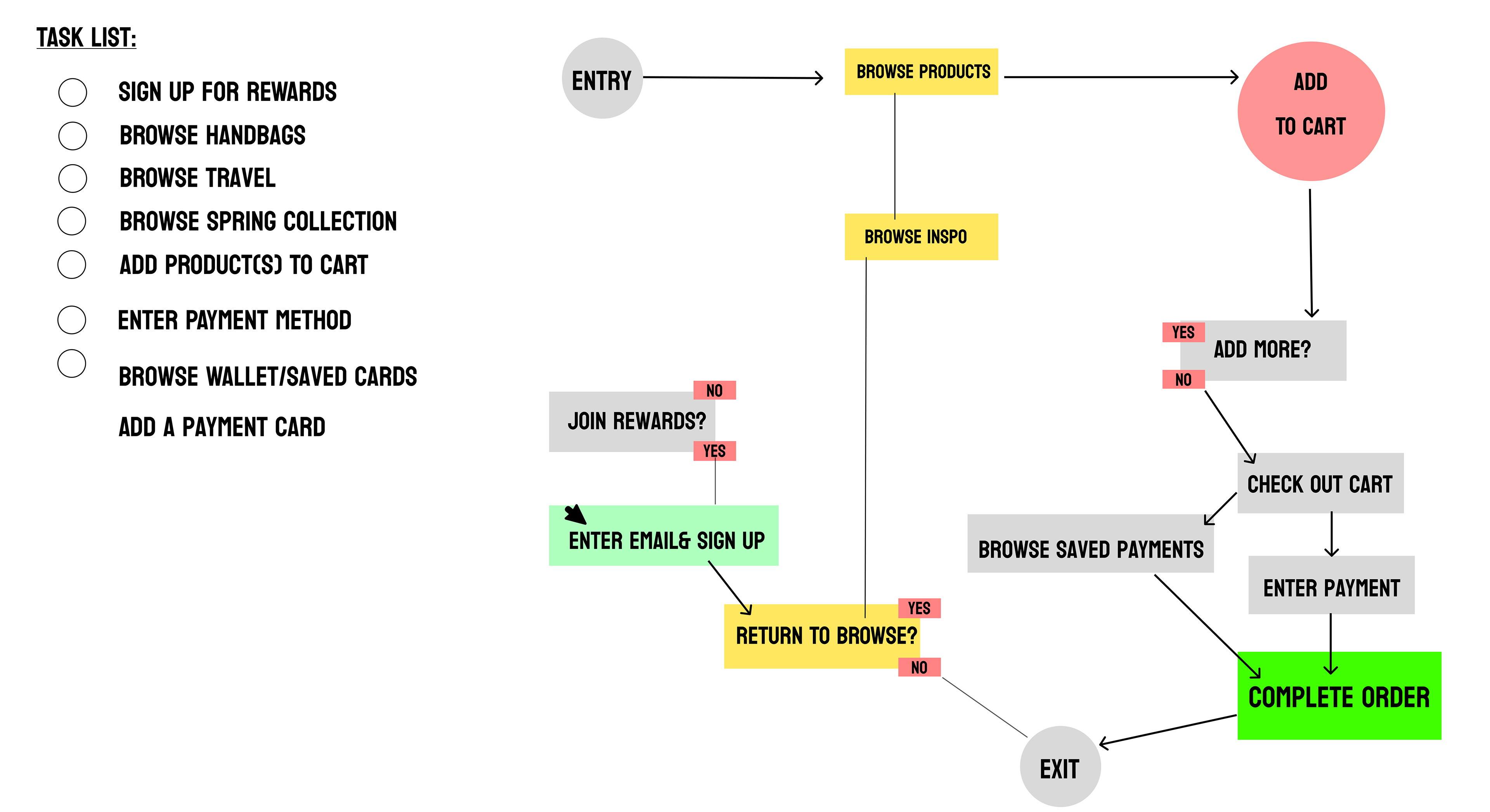
Since the goal of this project was to encourage users to complete certain tasks, I created a task list of all the actions I hoped for users to take while browsing the website. As an ecommerce website, the main tasks were to:
-Shop Summer (Seasonal) Collection
-Sign Up/In for Promotions & Rewards
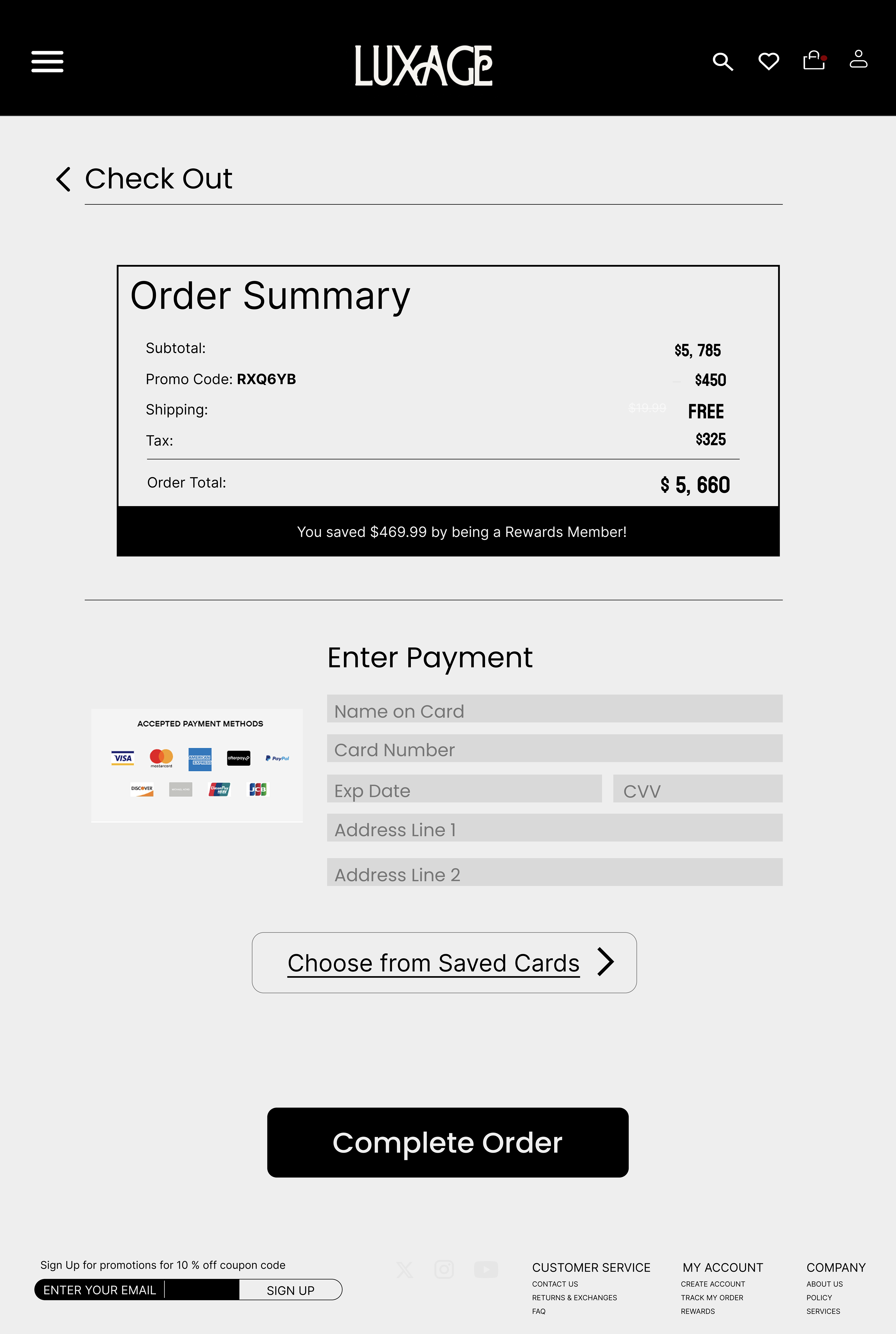
-Check Out
-Return to shopping (Add more products to user's cart to purchase)
-Enter Payment & Complete Order
Here's a copy of the user task list to the right:
What Was Achieved?
While referencing the initial task list I created, I was able to:
- Adjust any call to action for clarity. This allowed me to keep the design clean and focused on the task content.
-Prioritize visual hierarchy and organization. One of the most important things was that users could see different sections. Through spacing, intentional placement of media, and titles, the UI organization allowed users to successfully shop the categories they desire.
These steps were crucial to complete the main goal. Without clarity and organization, it would definitely make it more difficult for users to complete the tasks!
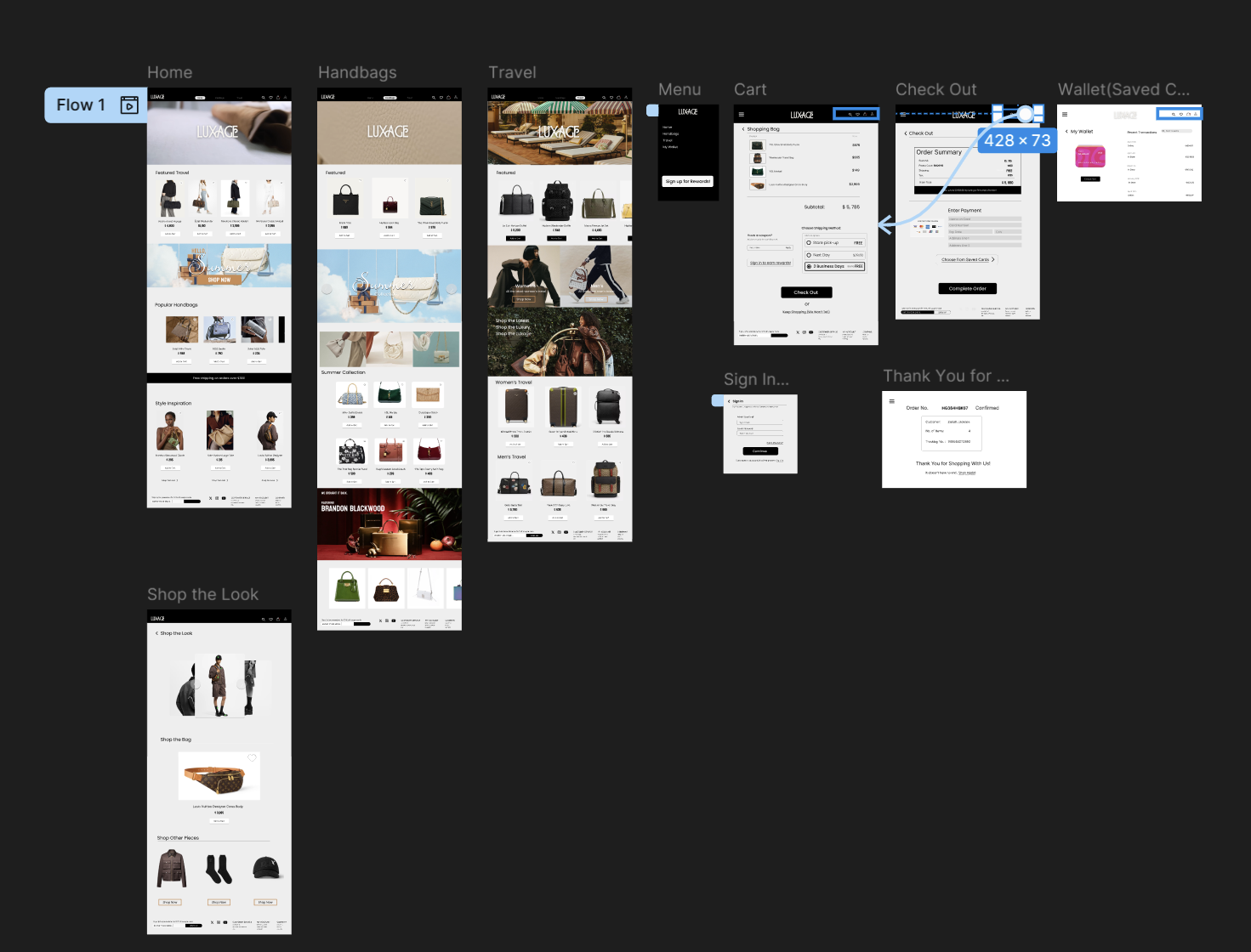
Gallery of Prototype:
Features to Highlight:
Save Feature
Typically for the save feature, I would create a component that simply changes color. This time I created a short, animated element to emphasize the process of "saving" a specific product. Take a look at the animation here:
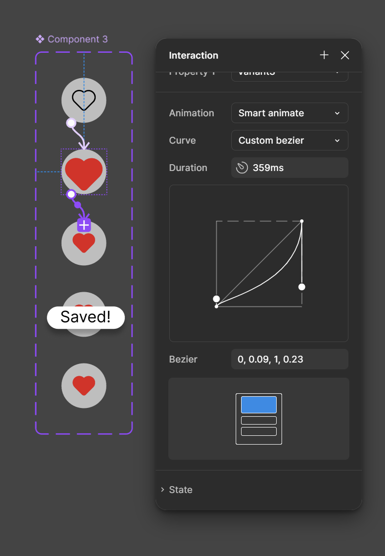
To create this animation, I used a custom Bezier. (The grow and shrink bounce effect) By manipulating its anchor points, I was able to control the speed (easing and timing), as well as the complete flow of the motion.
I was introduced the Bezier curve while learning motion graphics in Adobe After Effects. Though the programs are different, I was able to transfer the skills I learned making animations into the animation feature Figma provides.
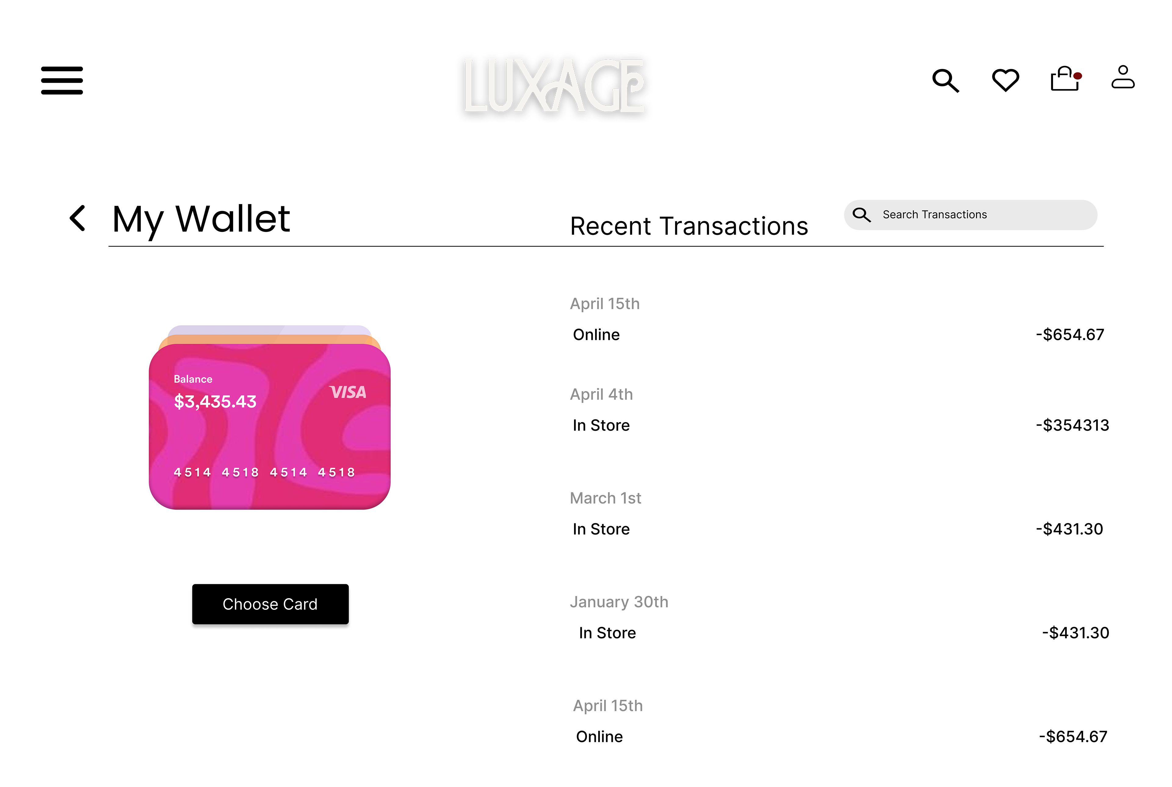
Choosing Saved Card Feature
To enhance the online shopping experience, shoppers love the option to save cards to their wallet. Often, without the option of having saved card information, users might not continue to shop if their card is not immediately accessible. This decreases the amount of time it takes for users to complete their order and encourages shopping with ease.
This feature for Luxage allows users to see which card specifically they are choosing, rather than just the card's numbers alone. My hope is that this specific feature will help users avoid accidentally ordering using a card they didn't intend to.
Take a look!