This project involves the creation of a brand--Game Son Animation studios. This was a project for an upper-level Visual Design course. In this project, I imagined a brand, designed the brand's logo & identity, as well as creating a logo animation and a sample homepage for its website.
Webpages Gallery
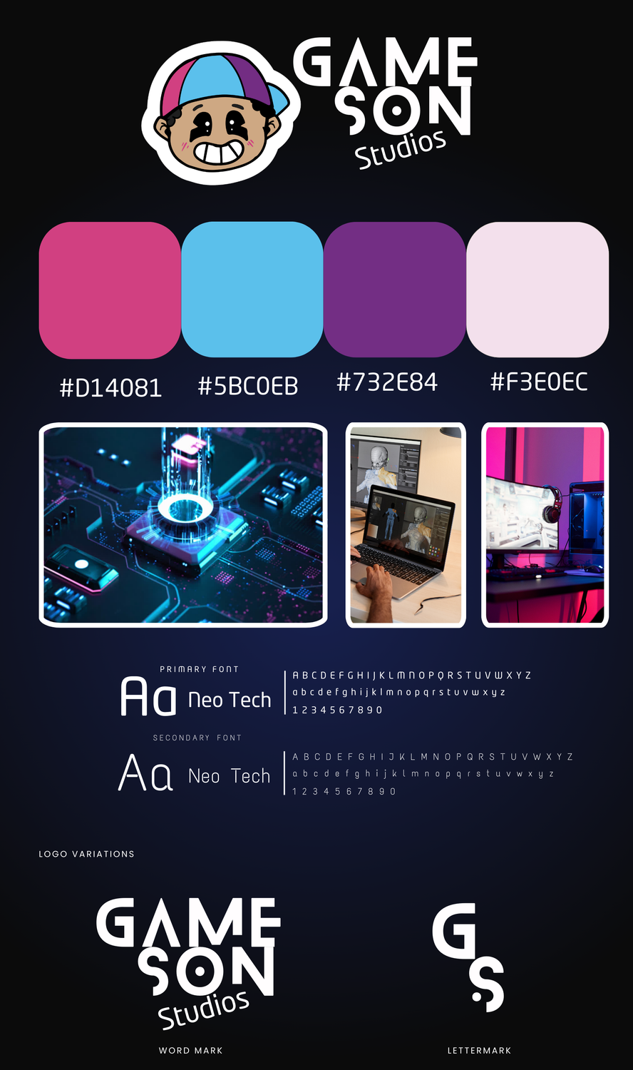
This is the brand identity page I created for Game Son Animation Studios. The company was created to perform as a studio offering services for all animation needs, but most particularly for gaming systems.
Color:
For this project, the colors were chosen with old arcade games in mind. I thought about how all of these gaming systems had the brightest colors that caught your attention because that's what they were meant to do--grab and keep your attention.
The color palette was inspired by this, being coming colors seen in games to catch the viewer's eye. These colors against a darker background as I've done for this brand page emit a feeling of technology.
Typography:
The typography and specific font choices were intentional, based on the idea of this being a tech company. I wanted to emphasize that both fonts reflect the font used in programming. My mind immediately associated both fonts with that, so I found it to be the best choice for GameSon.
WordMark & Lettermark:
The word mark was actually inspired by the idea of a loading logo, which is why some of the edges give viewers something to anticipate. I drew it out myself, then put it into illustrator to vectorize the image.
The idea of a logo loading is achieved my motion design animations, which is one of the exact service the company is meant to provide, which is what inspired the wordmark.
The letter mark utilizes the same idea and same text-style but includes a small dot where the S cuts off. The dot was an intentional addition, being the same dot displayed in the logo boy's eyes. It is meant to represent that grand child-like imagination, and that with GameSon studios, what we achieve for clients is limitless.
Logo Design
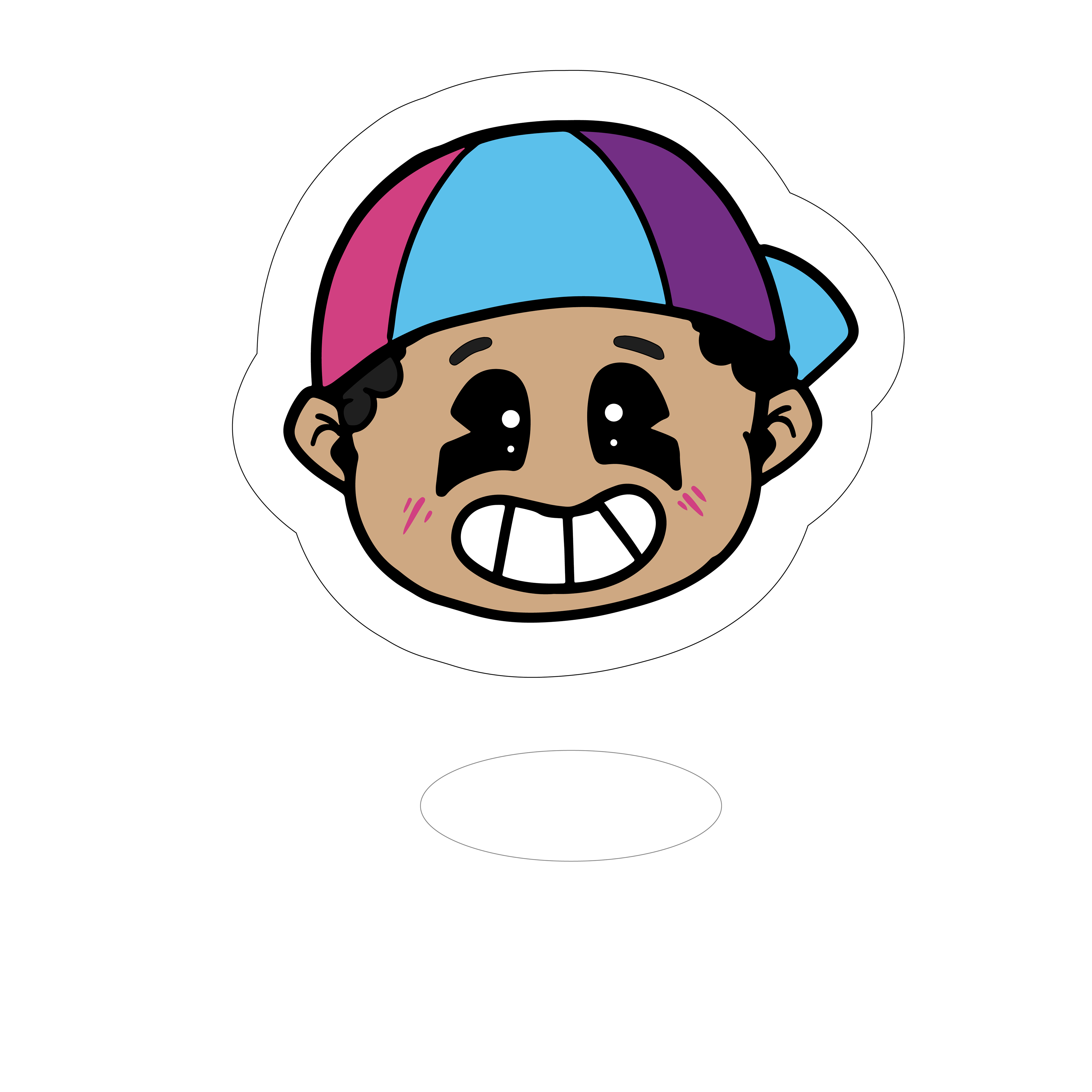
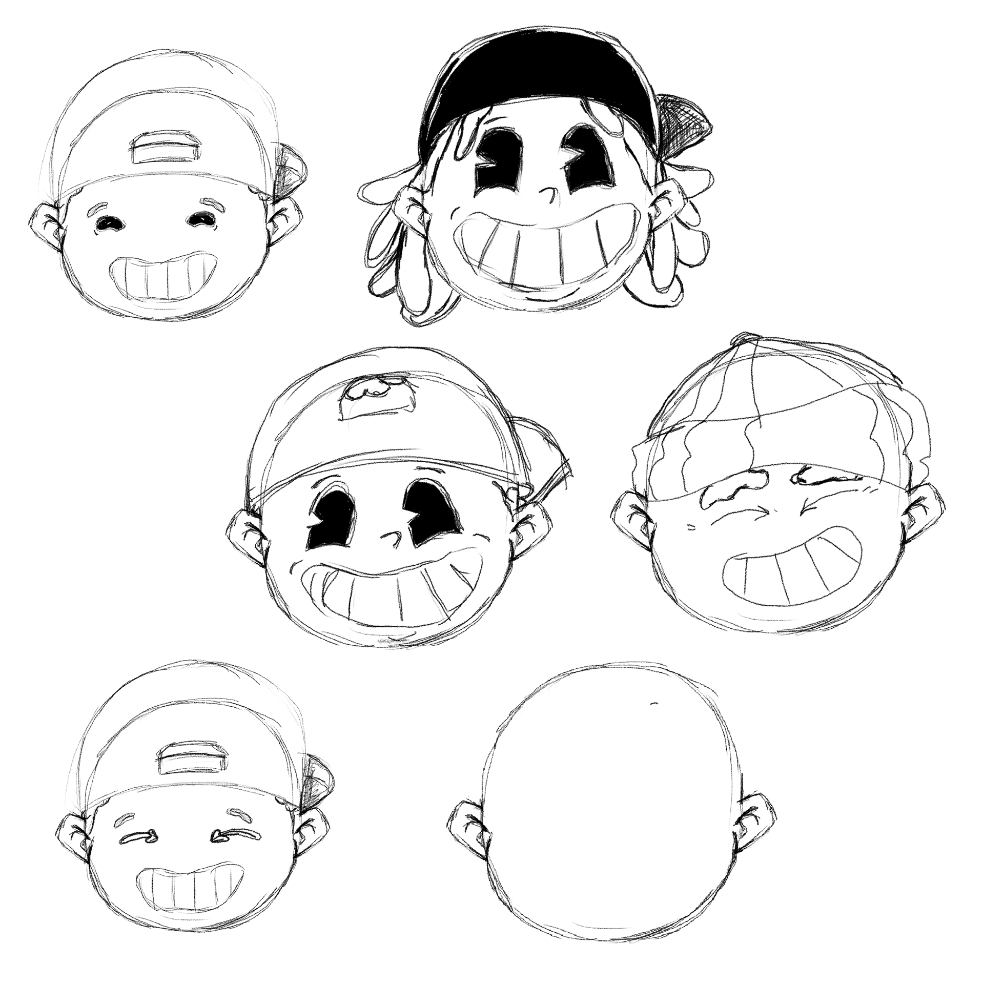
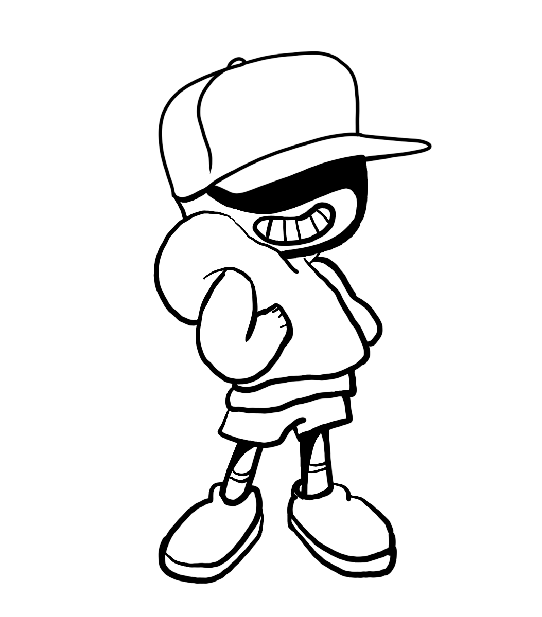
These images show the journey the logo sketch went through until I found the one that I felt portrayed the most "son"-like and imaginative imagery. The first depicted was the final decision, with the company's palette applied.
These images show the journey the logo sketch went through until I found the one that I felt portrayed the most "son"-like and imaginative imagery. The first depicted was the final decision, with the company's palette applied.
The others were decided against because I could not represent every quality and emotion that I wanted to portray.


Logo Animation
Using the Adobe motion design program After Effects, I planned out and developed an animation for the logo. I felt as though this design fit the brand created.
The beginning loading of the logo shows one of the simple, yet effective animations we could achieve for our clients as done for our own brand. It's short, yet memorable and can be cut off from the second half of this animation.
The second half launches you through space--to show just how limitless the client's imagination can be for GameSon to animate to life. The travel through space leads to the wordmark logo, showing that clients should always land with GameSon if they wish for their needs to be met by the right company.


